Here's a real hot logo I just finished designing today. It's for a Natural Gas Heating company, and by this fall, I should be completing a full branding suite as well. In the meantime, here's some insight into my logo design process.
To start off, my client wanted only to have a simple blue flame appear alongside a simple wordmark; pretty basic stuff. But this also meant I had carte blanche to do whatever I wanted.
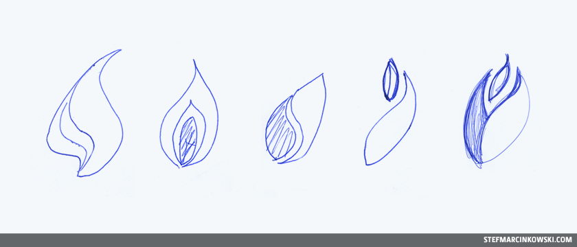
Now, when I come up with rough concepts, I typically skip the whole pen-and-paper thing and go straight to digital. The computer is highly-efficient most of the time, but for this logo, I wanted a truly organic flame, so I decided to make a bunch of sketches first. Here are just a few.
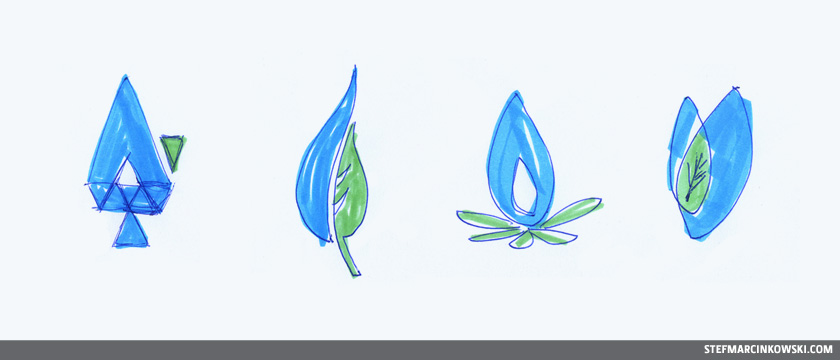
Green energy is the latest big thing, so I played around with the idea of flames and leaves and making them work together. Soon enough, I broke out my markers and started playing with colour.
Once ideas were flowing, I jumped to the computer and started playing around. At this early stage in the game, I don't get too hardcore with typography. I don't obsess over trying out 280 fonts, cuz those are relatively boring details which tend to bog down the design flow. I usually start a wordmark with just a few different typeface options, concentrating most of my effort on developing a strong icon. From there, the magic starts to happen. I prefer to keep things simple and I find much delight in playing around with shape, case, size, weight, colour, balance and tweaking individual letterforms to create typographical charm, character and personality. For this logo, "Select" is DIN Pro Bold with an additional heavy stroke applied, and the tagline is DIN Pro Medium.
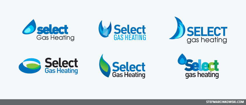
I came up with about 20 rough concepts, eventually narrowing it down to the best nine. Here are six of them.
I intensely wanted some green in the logo for punch and to sell the idea of green energy, but I wasn't sure how best to achieve this. The leaf idea wasn't going nearly as well as I'd hoped.
I have a repository of squillions of awesome logos that I refer to for inspiration. I never copy anyone else's work, cuz that shit always catches up with you, though I do often use ideas as springboards and/or combine ideas to take things to the next level. And in this case, I was particularly enamored with the super tight, transparent letters of the art gallery of alberta logo. Notice the bottom-right logo in the image above. This was the sexiest concept to move forward with, and my client agreed.
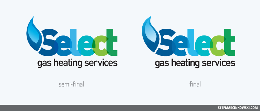
The word "services" needed to be added in, which worked out for the best as the logo now had a better balance and contrast between the wordmark and the tagline. My client also prefered the more realistic flame from another rough. Through experimentation and play, I nestled the flame into the "S" for a slick look. The curves weren't quite lining up yet, but it was a good start. Later versions of the logo would refine these and make for a more compelling final design.
I also tweaked the tagline: I chopped off the "r" in services to reduce an unwieldy gap between the "r" and the "v". The "t" was made taller to align with the top of the "h", the dots on the "i"s were changed from squares to circles, and the letter-spacing was tweaked manually.
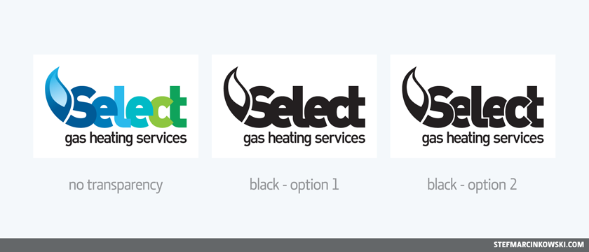
And just to be sure I was on the right track, I created an alternate version without any simulated transparency for limited use, such as on newsprint or at extremely reduced sizes.
It should be noted that the transparency in the final logo is "simulated", since no one can guarantee how actual transparency will print. There will never be a spot colour version of this logo, since it's made up of eleven CMYK swatches. This logo will print flawlessly against white, black or photo backgrounds. Always take care when working with transparency in logos!
So finally, it came time to create black-only and reverse versions. At first, the letters were far too tight; this was an oversight right from the beginning. So I created a second black-only option that included keyline breaks between the letters. Following the standard logo's overlap logic (where each letter appears atop the letter to its right and beneath the letter to its left), the logo looked painfully awkward and was barely readable. So I pulled the "l" and "c" forward to enhance readability. This helped a bit, but it was a poor, knee-jerk solution that violated the spirit of the original colour logo. It was at this point I got the idea to open up the spurs of both "e" shapes. Success! Readability was no longer the critical issue it once was. Sure, I had to go back and apply those same changes to all the other versions, but the extra effort was worth it.
Had I designed the logo in black first, I could've avoided this extra challenge, but I likely would've had only limited success with the transparency effect. In the end, black - option 1 (below) was chosen for all single-colour versions, and everything is now happily ever after.
Technically, this logo won't be going live for another few months, but I gotta admit: I'm not totally happy with either of the flame's two leftmost curves. I'm seeing some bulges and flat spots that I will no doubt go back in and tweak. But that's just my hypercritical eye.
Enjoy!