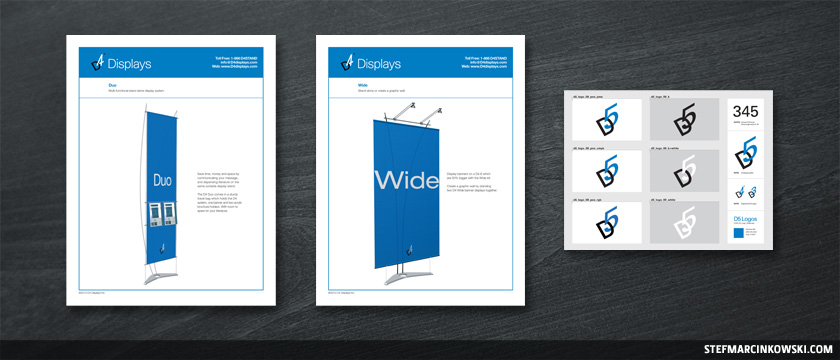
This post is currently being reworked to showcase a much wider spectrum of work I've done for Dimensions Displays. The best of the best will be featured from over 75 projects, including ads, brochures, catalogues, illustration, web design and award-winning trade show display graphics. Update coming soon, so stay tuned.
For over 10 years, I've been doing graphic design for Dimensions Displays, and the branding has always been simple, clean and elegant. Lots of crisp whites and that classic Pantone 285 blue.
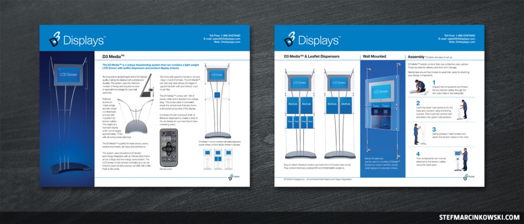
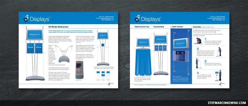
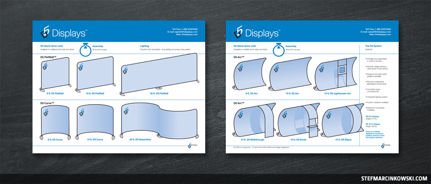
Here are several of the many projects I've worked on during that time. The above sample is a double-sided 11" x 8.5" product sheet (image on left is the front), and here's a similar layout for a slightly different product.
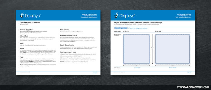
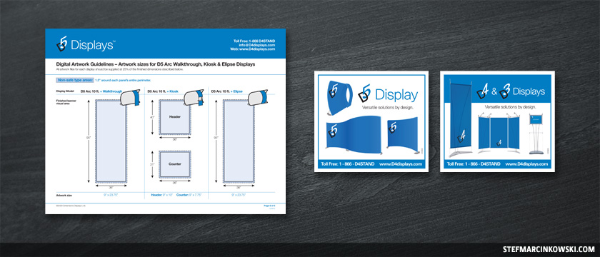
Here's two pages of a five-page artwork submission guidelines package I created.
Here's an overview of a new line of display systems, all drawn to scale as vector art.
Below, in the sample on the left, I came up with the idea to include the three little icons in the upper-right corners to help the customer visualize the panels and how they fit together.
And here are two magazine ads.
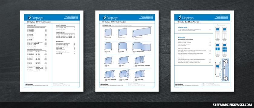
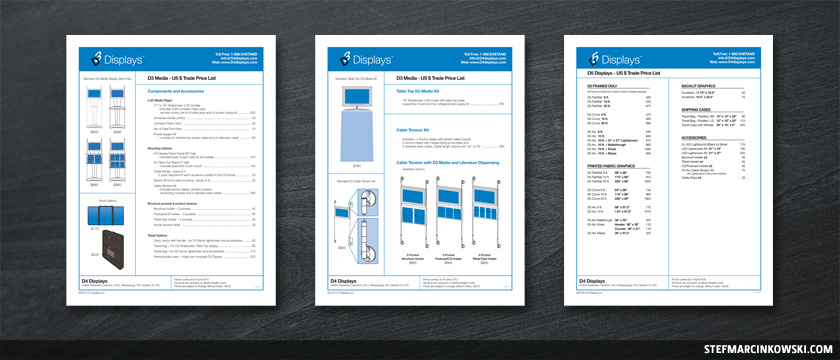
Here are some price lists.
Over the years, I've taken photos of many of Dimensions' products and converted them into vector art for a couple reasons. First, they look sharp at any resolution, and second, they keep filesizes manageable for customers who download many PDF resources.
Now, as products evolve, photography can become out-of-date. Rather than spend squillions of dollars on all-new photography each year, it's more economical to simply alter images digitally. Details can be changed, added or removed altogether.
And lastly, here's a logo sheet I created for an all-new product launch.
I've done tons more, including tradeshow booth displays, backlites, large-format graphics, mini-branding and even exploded-view diagrams. I'll be sure to show some of that stuff sometime soon.
Enjoy!
