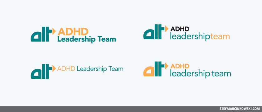
Earlier this year, I had a logo design project come in for a new salesforce initiative. The team wanted a logo that played-off their existing product's look and feel, and I was totally koo with that. But I wanted to take things even further. So, while they only asked for pancakes, I gave them their pancakes, in addition to a huge stack of french toast with whipped cream and fresh strawberries. Above is my primary concept; the design I felt was the strongest and most capable.
And here are my four secondary concepts, more-or-less variations on the above. When it comes to typography, I like to play with colours, case, weight and scale for tons of opportunities to strike the best balance of form and function.

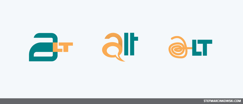
Now these five options still weren't enough for me. I was really going for the gold here. So I came up with an additional twelve tertiary concepts. I was on a roll.

And rollin'...

...rollin' rollin' rollin'...

...cuz this is how I roll.

Booyahkah! These seventeen options will totally blow 'em all away, amirite?
Nope.
In the end, the client went for a really simple, stripped-down logo, made from parts of their actual product logo. Wow.
So yeah, it happens to everyone from time to time.
Enjoy!
