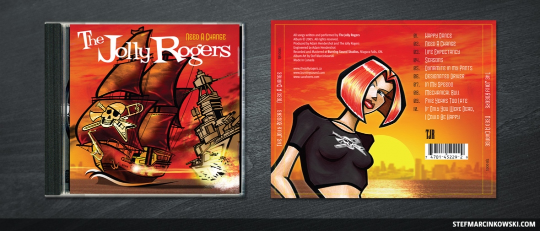
Back in 2005, The Jolly Rogers were Hamilton's hottest ska-punk sound. So when it came time for the band to record their first studio album, I jumped at the opportunity to create the artwork for it.
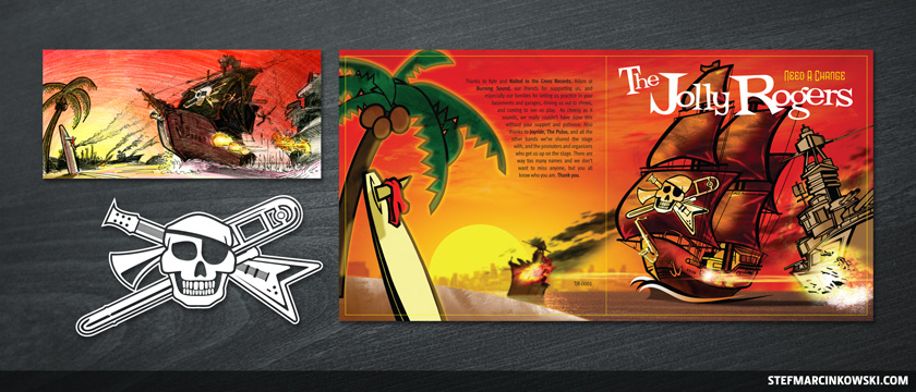
First, band member Tyler presented me with his kickass logo concept combining a skull, guitar and trombone. I refined the design and created a suitably playful and evocative wordmark to complement it.
From there, I came up with a concept for a wraparound album cover that featured a pirate ship firing its cannons and blowing battleships out of the water. The idea was that The Jolly Rogers were a new generation of stripped-down rockers: definitely not your grandfather's metal.
The band loved the concept, and I created a full illustration using marker on bristol, Photoshop and Illustrator. As a bonus situation, Sarah Zero got a back cover cameo!
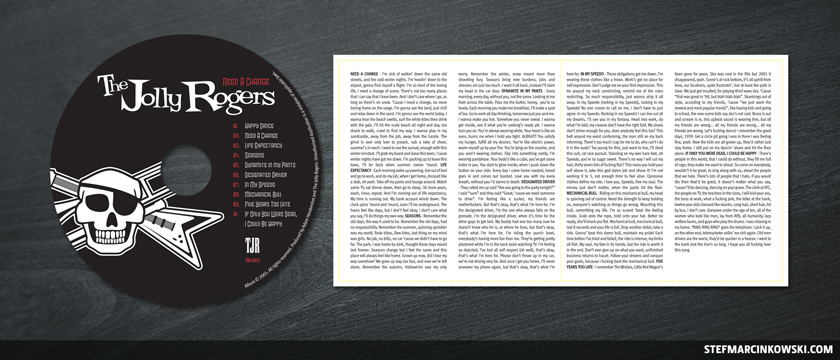
Here's the 3-colour CD label and inner cover sleeve with the album lyrics.

Not shown here are the band's 2005-era website, for which I did the graphics, and a white-on-black logo T-Shirt, which sold like hotcakes.
And here's the final logo, as well as the initial sketch contrasting the final art.
Enjoy!

