A couple years ago, I had this super rush, mini-branding job for the NCCH.
They needed a whole bunch of pieces for an upcoming event, and NCCH didn't really have much of an identity that I was aware of. In fact, the only things supplied were sizes, copy, sponsor logos and the vector bike art. And since time was non-existent, I basically had carte blance to come up with something striking, fast.
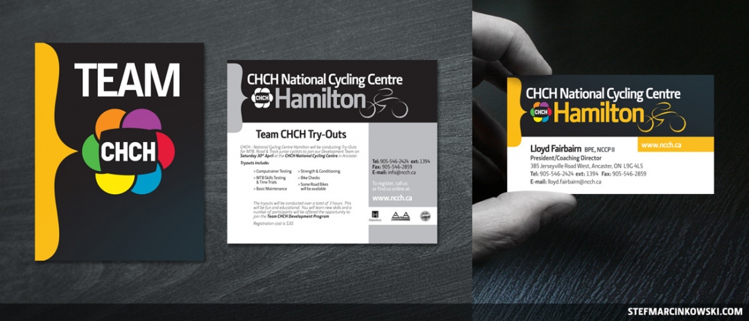
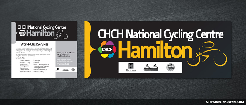
CHCH is a Hamilton TV station that's a proud sponsor of the Cycling Centre, so I started with their nice, rich black for the backgrounds. For the amber colour, I blended the orange and yellow portions of the TV station logo. Then, for a spark of visual interest, I came up with a simple parentheses to use as a design element.
Above is a poster, newspaper ad and business card design.
And here's a second newspaper ad with slightly different copy, and a huge 70" x 27" banner.
Enjoy!

