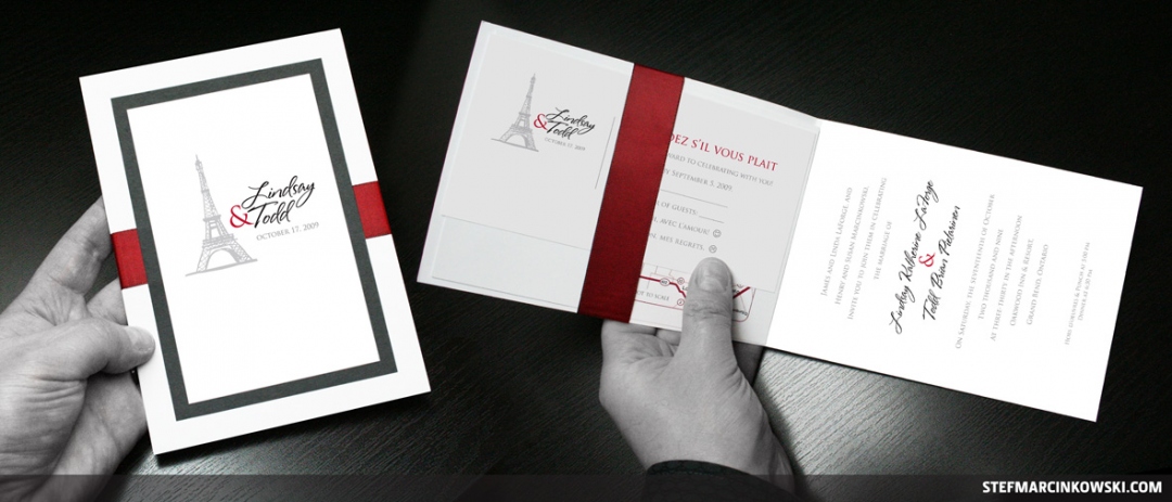
Here's a full wedding package I made for Lindsay & Todd.
They wanted a classic, yet modern feel for their special day, and had an idea in mind for a logo that combined their names with the Eiffel tower. Todd proposed to Lindsay there, and that moment became their wedding theme: a living tribute to France and the many other places they'd been together.
Claret was chosen to be the accent colour, so I started there, tempering it with lots of crisp whites and a soft, frost grey.
Lindsay had been reading squillions of wedding magazines and formed a strong vision for all the pieces and how they were to work and fit together. My initial consultation and subsequent approvals with her were so efficient that the pieces pretty much designed themselves.
The wedding invitation was a fold-out that contained separate RSVP and map cards inside, which were both held in place by a silk ribbon that wrapped around the front cover panel. The map card inside was drawn as vector art and styled to match the aesthetic of the rest of the pieces.
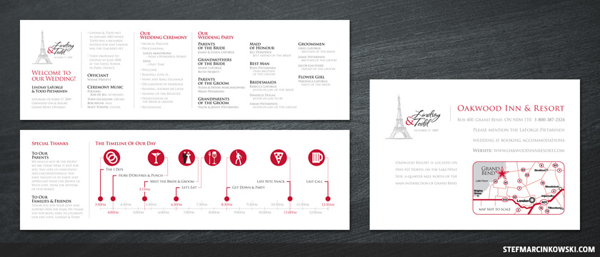
Perhaps the pièce de résistance of the suite were the stunning 14" x 4.25", double-sided wedding programs. The front introduced Lindsay & Todd as well as their officiant, music, ceremony details and full wedding party. The back featured special thank yous and a very sexy timeline.

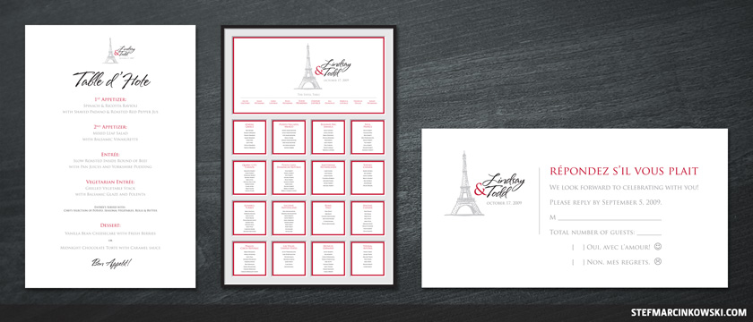
Also created were a menu and a 20" x 30" seating chart designed to give the illusion of being made of several layers of matte board. Also, here's a better look at the RSVP.

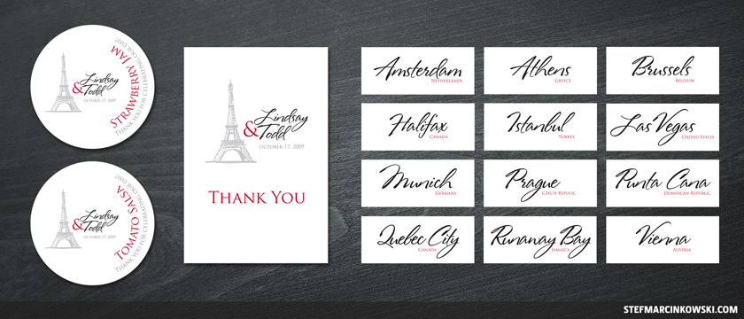
Circular labels were designed for jam and salsa, and gift card box signage (not shown) was also made.
Each of the tables were named after places Lindsay & Todd had visited together (12 of 16 table cards shown), and "thank you" cards were the finishing touch.

The sizes of all of the pieces and their arrangements on substrate were highly strategic to allow Lindsay & Todd to economically print out everything onto thick 11x17 stock at their local copy centre, for a fraction of what it would normally cost to go with a print shop.
Sadly, all the cutting, folding, gluing and assembling were done by Lindsay & Todd themselves. But I made it foolproof for them by putting very faint cut and fold marks onto all the PDFs.
And the wedding was totally kickass awesome, marred only by my wandering onto the golf course's 18th green and stealing some random dude's golf ball. Please don't tell anyone.
