
28,000 years ago, back in my College days, I worked for A&P as a produce department chalkboard artist. I was specifically hired for my artistic abilities, and I managed to beat out several other candidates who didn’t know the difference between a piece of chalk and a head of lettuce.
I quickly put my best-in-class art skills to the test, which helped my store quickly solidify its reputation for having the best-looking chalkboards in town. They were so good, that three other A&P stores hired me to do their chalkboards as well. But wait, there’s more. A&P had incited a city-wide chalkboard craze: suddenly every business was buying chalkboards and wanting me to draw on them, including a bagel shop and even a night club. My chalkboards became so prolific, my art was featured on the cover of an A&P corporate report.
But you know how it goes: all good things must come to an end. It all started when one local A&P store closed, and everybody in the city started bumping each other over seniority. And even though I’d amassed 3 years experience, the floral department girl, with 4 years experience, bumped me and took over my job. At the bottom of the food chain, I had nobody to bump, so I bumped myself permanently out the back door.
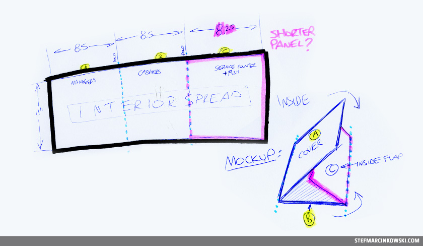
Fast forward to 2008, where A&P rebranded itself as metro. Shortly before the big relaunch, I learned of a rush job to create a bilingual, six-panel uniform catalogue for metro/UBA Uniforms. The project started out as a simple, 8.5” x 11” (closed) trifold brochure.
Here is my initial sketch of how the piece was to fold:
Awesome. This was exactly how it was intended to work. Time to start making art.
Whoa, not so fast. Making art for this project would have to be done almost entirely from scratch, as pretty much no original art was supplied: no logos, photos, branding elements or guidelines, not even brand colours. For the first time, I was creating a corporate piece almost entirely blind.
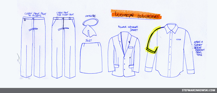
In fact, the only art supplied were some random fashion model illustrations and catalogue cover from another client. In addition, head office supplied dark, smudgy faxes and colour printouts of vector uniform art. It was not possible to get this art, so I started by tracing the hardcopy outputs onto clean sheets of paper via a light table and ballpoint pen. Even at this early stage, many uniform details needed to be changed from what was originally supplied.
Here are a few of those early tracings:
Designing real uniforms is an evolutionary process, and even the slightest of changes can have a cascading effect throughout an entire supply chain. All throughout the design process, there were numerous and repeated revisions to the uniform details, and many came in at the last minute. I constantly updated details, such as: pockets and buttons and their size, number and location, as well as pleat, collar and cuff details, sleeve lengths, belt loop treatments, and more.
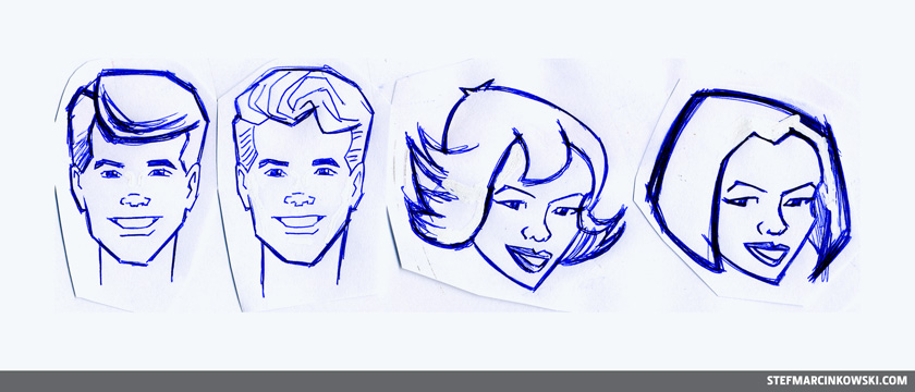
Once the basic lineart sketches were approved, I scanned them all in and began redrawing them as vector art. Simple enough. But the uniforms needed to be fleshed out to look like real people, so I created hands, feet and a few heads. I was feeling impulsive, and created a Sarah Zero-esque head, including her signature bob haircut:
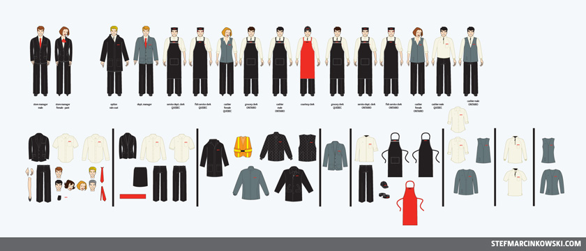
Once all the individual vector pieces were created, I matched everything up by department and gender. Here is the master vector file, comprised of all possible uniform combinations:
In the end, some of these pieces were not used or continued to change up until the last minute.
Finally, it was time to start on the layout. I still hadn’t seen any metro creative yet, and it was still unclear whether this piece would be branded as metro or as UBA Uniforms.
Without too much time or effort, I created a couple simple, generic sizing charts and dropped everything into this somewhat brand-neutral layout:
Shortly after this was presented, it was decided that the uniform catalogue would no longer be bilingual. English and french would now be separate files, so in an effort to recover a portion of the increased printing costs, the layouts were tweaked to remove all bleed.
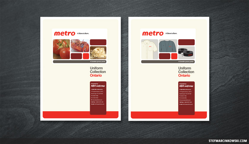
Also, a brand new metro website landing page had just launched, which was to dictate the overall look and feel of this piece. I quickly adapted the landing page for use as a new cover. The first-draft cover included placeholder images for food (left), and was quickly revised to feature images of the uniforms (right):
However, it was felt that the cover was either too-branded, or too-bland, I honestly don’t remember which. The decision was then made to juice up the cover with lots of metro red and add an illustration of two women cashiers. More on this later.
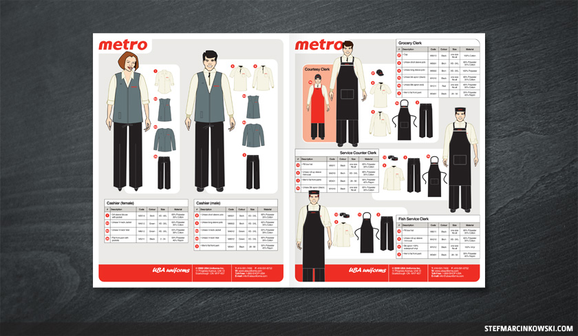
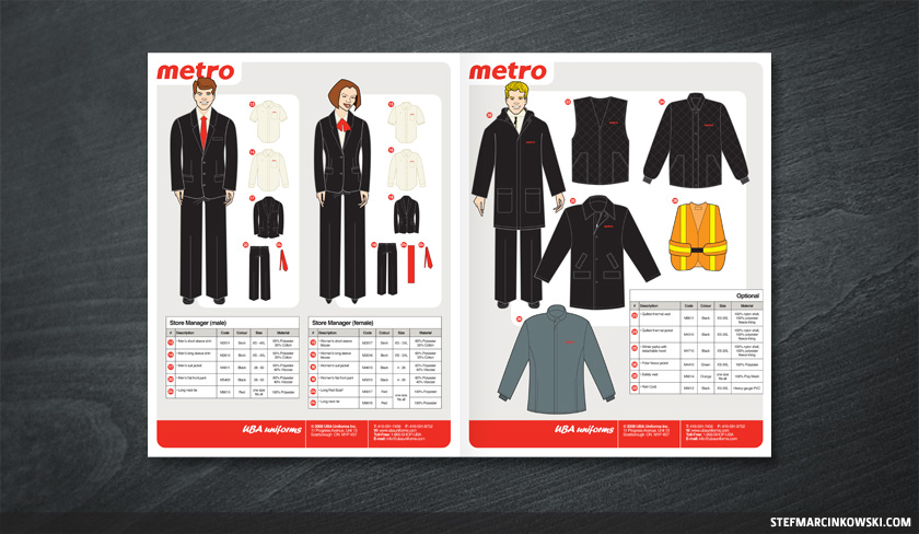
The catalogue’s insides were coming along and were nearly complete, though decisions were still being made about what the Ontario and Québec people would be wearing. There were many significant uniform differences between the two provinces, and each catalogue included a few pieces that were not available in the other.
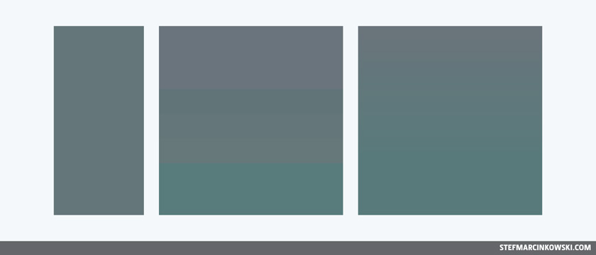
For the most part, this project was pretty smooth sailing; the only major puzzle that needed solving were the colours. Specifically, the uniform’s beige “birch” and greenish-gray “castor” needed to be properly matched. While the uniform’s black and red were pretty straightforward, the birch and castor were nothing at all like any standard Pantone® swatch. To nail the colours, I requested actual fabric swatches, started with their closest Pantone® match, and tweaked them to create customized CMYK colours that I tested and refined until they were virtually perfect.
Here is a sample of my castor colour tests:
Eventually, all matters were settled, and it was full steam ahead for printing.
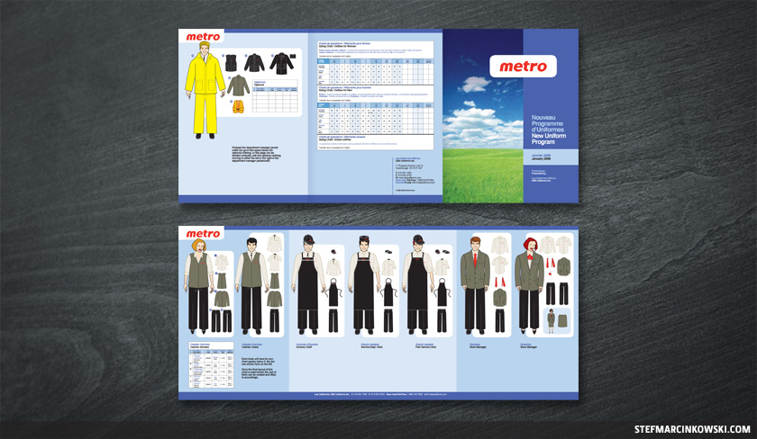
Here is the final english uniform catalogue, which was converted at the last minute to an 8-page, staple-bound booklet:
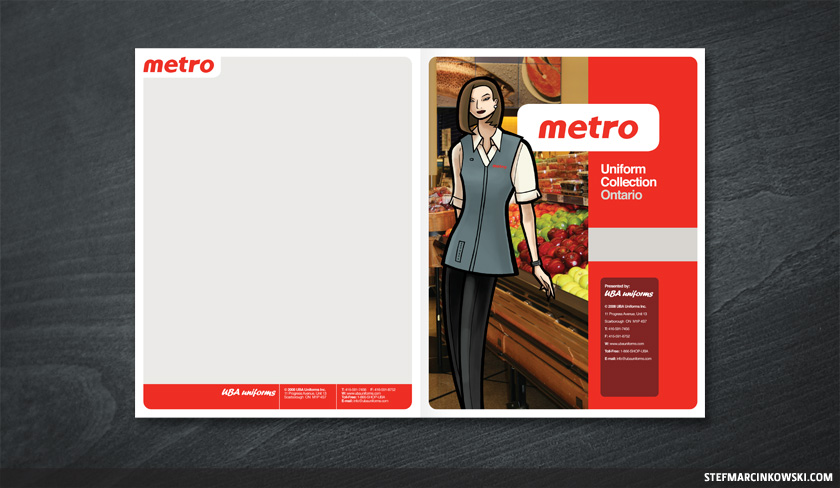
The front cover features a hand-drawn cashier that was loosely based on some random fashion model illustrations that were supplied with the initial project brief.
With regard to the inner page spreads, I tried my best to group all content into neat, modular blocks. This proved impossible for a couple pages, particularly french pages, which were profoundly cramped in a few spots. C’est dommage.
By now, the english layout was 99% approved, so I was ready to start on the french. Fitting the french translations into the same little spaces as the english proved to be most challenging and time consuming. To speed up the approval process, I filled in all the missing translations myself using Google, the OSX dashboard widget and my rusty highschool french. Les yeux du chat brillent dans le noir.
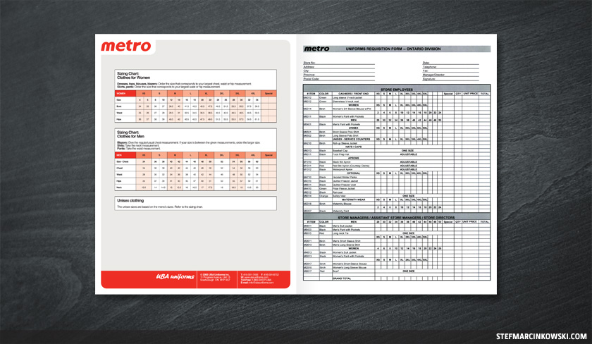
Full disclosure: the reason the uniform catalogue was expanded from six to eight pages was because we all forgot to include one very crucial element: an order form. One was promptly added to the inside back cover:
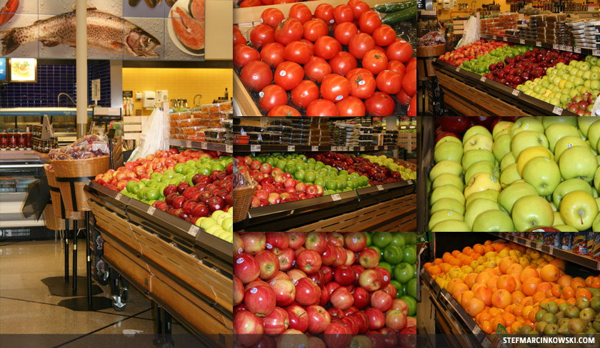
Getting back to the front cover, the background is a photo I took at a local 24-hour A&P store. I wanted to be incognito, so I went in super late, around 1am. However, much to my surprise, there was some dude working the product just a few feet away from the tomatoes I was photographing. He was not impressed, and he kept giving me the evil eye. “Don’t make eye contact, don’t make eye contact”, I repeated to myself as I took a few more shots. Mission impossible accomplished.
Here are a few of the shots; I ended up using the one on the far left:
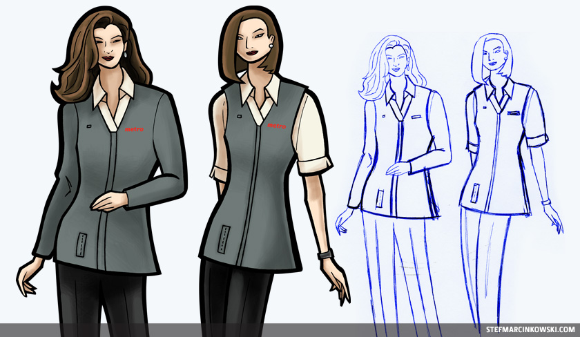
The original plan was to feature two cashier models on the cover; one wearing a long-sleeve uniform and one wearing a short-sleeve. In the end, the decision was made to go with only one model.
I concede, the uniform catalogue’s inside vector people were needlessly stiff, so for the front cover, I wanted to add more life to the uniforms. Using markers and pens on Bristol, I drew two loose, organic, Sarah Zero-style models. I scanned in the lineart, cleaned them up, and coloured them digitally with a tablet. This was my first attempt at “fashion” illustration, basing my art entirely on my best guess as to how the flat vector art would look on an actual person.
Here are the original sketches and final illustrations:
This project was a super hardcore rush, which included many late nights and a few weekends, though it took exactly 9 weeks from first meeting to final upload. Once I sent out a proof, it took anywhere from a few days up to a full week before I’d hear back with revisions. I’d then have 28 seconds to make all the changes and send it back out again. In total, the project was completed in 14 english and 12 french iterations.
Excellent customer service is paramount in business, and particularly in design, as so few clients are aware of what’s actually involved, and not many designers are willing or able to go that extra mile. I spent a fair bit of time driving out to meet with UBA to show printed proofs, answer questions, explain concepts and processes, provide options and make their experience as easy and as enjoyable as possible.
Then, shortly after this project was complete, I finally saw actual employees wearing these uniforms in the rebranded stores. It was an incredibly gratifying sensation to be part of something so much bigger than myself.
If metro ever brings back the chalkboards, I’d happily return to the produce department and wear the new uniform with twice as much pride.
Enjoy!