Years ago, I worked for Royal Bank of Canda in downtown Toronto. I worked on simple pieces at first, such as updating magazine ads, tweaking direct mail pieces and performing general image search. Over time, I created new pieces from scratch;
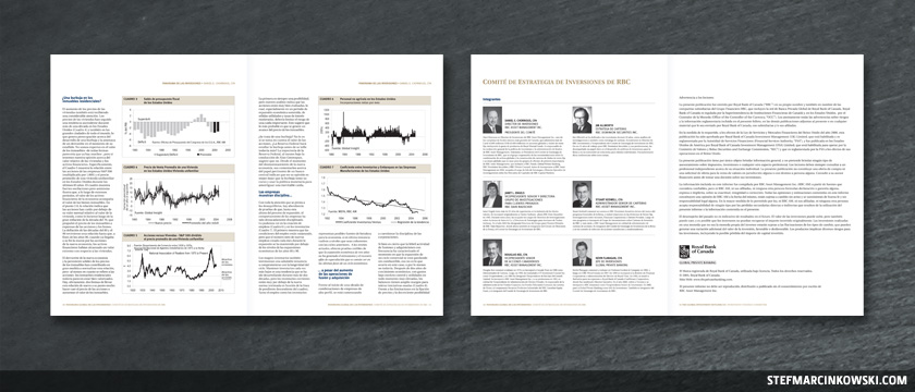
...worked on some higher-end financial reports;
...and even cleaned up the graphic department's fonts.
Around this time, RBC had just gotten their logo approved for registered trademark use, and I jumped at the chance to update their entire suite of logos used worldwide.
While the classic "Leo" shield and wordmark were to remain untouched, adding the ® was a key element. The first step was to centralize all the existing logos and go through each with a fine-toothed comb. Some logos were obsolete. Some needed tweaking. And a few new ones needed to be created. In all, over 35 business divisions required english and french logos, and a few needed spanish and chinese logos, too.
Since everything needed to be cleaned up and standardized, a single master was created. It included positive and reverse versions of the shield, mated to the ®. Next, wordmarks for each division were brought in, corrected and aligned to a grid. Filename conventions were implemented as each division was saved out as its own master. The next step was to create all the positive and reverse colour variations for each division. Finally, web versions of all the vector logos were created.
Updating the RBC logo was a very complex, meticulous job that spanned several months, and remains one of the most personally satisfying projects I've ever done.
In all, I created over 50 marketing pieces and financial reports for RBC, though I didn't think at the time to get a copy of everything. Should I ever return to RBC, I'll make up for this oversight by getting TEN of everything. I'm calculating for growth and interest.
Enjoy!