A couple years ago, I created this complete identity for a brand new company.
I basically had carte blanche, which is always nice, and it also helped that the client was easy to work with and well-organized.
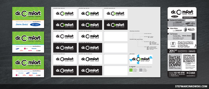
I started off by establishing a "green living" vibe and colour scheme, then I went on to design the logo around this concept. Perhaps surprisingly, the logo's wordmark is not a font; it was actually made entirely from scratch using only circles and rectangles. A full suite of logos was created, including CMYK, RGB, PMS, black, greyscale and reverse versions. Finally, a logo master sheet PDF was created.
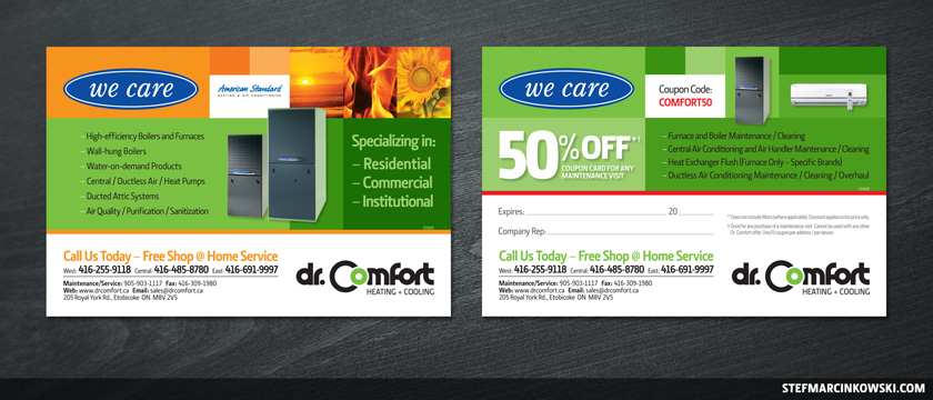
From there, a business card template and three double-sided 4x6 postcards were created using stock photos as well as images and logos gathered from various manufacturers and suppliers.
Here are the other two postcard backs.
And finally, here are the three postcard fronts, the logo master sheet and a newspaper ad created as the project's finishing touch.
Enjoy!