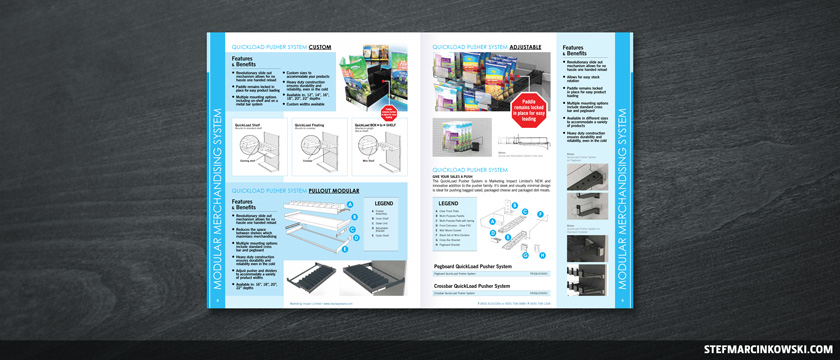
Marketing Impact Limited is Canada’s leading manufacturer of display and merchandising systems. You’ve seen their work in virtually every store you visit, from Walmart to Sobeys. Every time you pull a bag of lettuce, or whatever, from a shelf, and the product behind pushes forward, chances are that’s a Quickload Pusher System. MIL also makes tons of other products, including security boxes, sign holders, trays, dividers, hooks, bins and gorgeous custom POP displays.
I was recently brought in to create an emergency, super-rush project; a 16-page mini catalogue for an upcoming trade show.
I was to take two existing InDesign files (with two totally different looks), and merge them into one new file. I needed to bash a portion of last year’s mini catalogue with content from this year’s incomplete, 200+ page catalogue. Another designer had started the 2013 catalogue, was unable to finish it, and there wasn’t enough time for anyone on the planet to complete it in time.
On my first day, I was seated in a large, open-concept studio, next to what I thought was a ridiculously-oversized coffee vending machine. It kept buzzing away all day without letting up for a single moment.
The creative team then joined me to describe the sheer scope of this project. It took nearly two hours to go through everything, as it was a lot for any outsider to take in all at once. Move this here, flip these sections around, split this up, delete this part, replace that thing with this thing, compress this, ignore that… that sort of thing. I had to get up to speed on tons of products, specs and industry jargon very quickly.
The vending machine buzzed away.
After the brief, I spent some time going over all the notes, consolidating info and asking more questions. I decided the smartest thing to do was to start out with a cut-and-tape paper mockup.
The vending machine continued to buzz away. I finally glanced over at it and said, “That’s one REALLY strong cup of coffee you’ve got brewing”.
LOL. Everyone in the department had a really good laugh at my expense, as it turned out that this “coffee vending machine” was, in fact, a 3D printer.
With a couple changes to the mockup, I finally jumped on the computer. I must admit, the source files were in rough shape: no masters, stylesheets or page numbering, millions of little text boxes, tons of unnecessary transparency, and there was simply no time for me to start from scratch.
So, I started by pasting existing content into a new document. It was a super rough, ghetto layout with content literally dropped-in caveman-style, just to get it in there. In between layout reviews, I’d continue to refine the visuals. When blocking-in this kind of work, always think of a funnel: big stuff first, finer details later. Focus on content first, and style second.
I did create much-needed master pages and paragraph styles for the headers, subheads and select body copy, but that was about all. Throughout the design process, pages did get shuffled more than once, and proper masters and page numbering made shuffling a breeze.
As things came together, several brand new products needed to be added, and the decision was made to go up to 20 pages. And despite the increased page count, more content continued to be squeezed in, as going up to 24 pages was not an option.
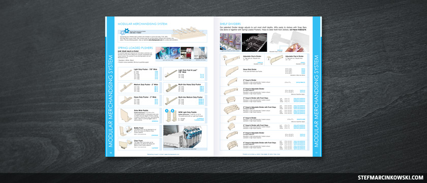
Working with 3D lineart renders was a new experience for me. MIL’s industrial designers rendered their 3D product models as Adobe Illustrator vector art, and I needed to change the fill colours on a few. It was taking me forever, so the guys showed me how to use Illustrator’s Live Paint tool. Wow. Ya learn something new every day.
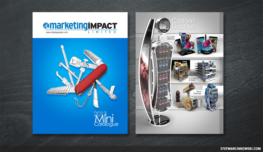
The mini catalogue was finally nearing completion. The back cover was created by the previous designer, was pre-approved, and was not expected to change. The front cover image was also pre-approved, though I played with the layout and came up with the sexy "2013 Mini Catalogue" title treatment. However, there were last-minute second thoughts regarding the cover image, so I immediately offered to come up with an alternative design. I envisioned MIL’s products as a “fix-all solution”, so I came up with the metaphor of a modified Swiss Army knife. I Photoshopped a quick mockup that was loved, but ultimately not used, as the rest of the booth was already branded with the existing cover image. For consistent messaging, it was decided that the cover could not be changed.
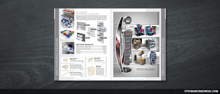
I also created a custom displays page in about an hour, which was approved on its first draft with no changes.
Here is the rough, alternate Swiss Army knife cover and a closeup of the custom displays page:
Several people helped with the proofing process, and shortly before final sign-off, I took a crack at proofing myself, too, and corrected over 60 typos and typographical inconsistencies. In all, the 2013 mini catalogue went through 13 iterations over the course of 9 days; a very fast-paced approval process, indeed.
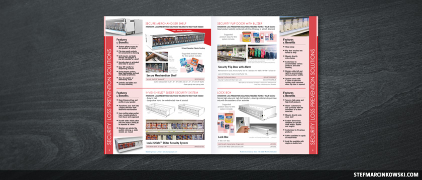
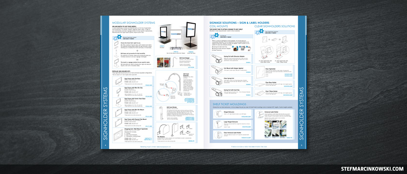
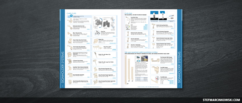
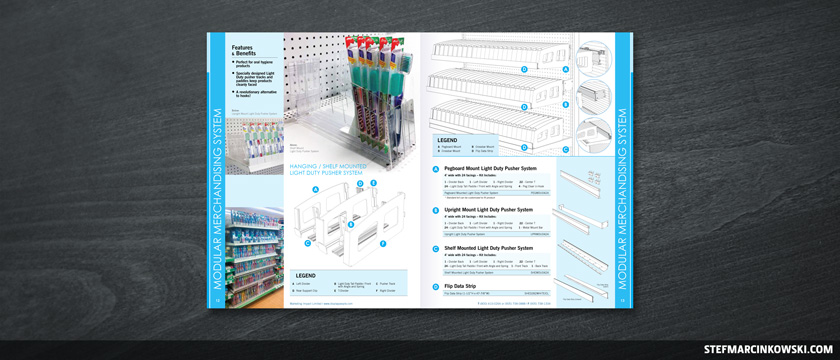
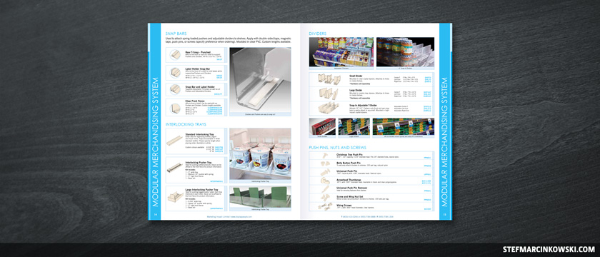
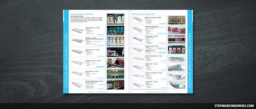
Let's rush through the three remaining page spreads, as I seem to have run out of body copy.
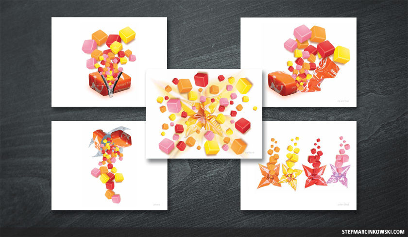
Finally, as part of a separate side project, I was asked to brainstorm some visual concepts for Starburst Minis. I came up with five that were very well-received, particularly the one concept I hoped they’d pick: the one with the zipper. I didn’t get the chance to follow up or continue on this project, though I certainly do look forward to seeing the final creative.
Enjoy!
LOGOS, BROCHURES, BUSINESS CARDS, POSTERS, POSTCARDS, DIRECT MAIL, REPORTS, CATALOGUES, BINDERS, BOOK COVERS, POCKET FOLDERS, ADVERTISING AND MARKETING PIECES, STATIONERY, LETTERHEAD, ENVELOPES, NEWSPAPERS, MAGAZINES, BANNERS, TRADE SHOW DISPLAYS, PACKAGING, P.O.P. DISPLAYS, SHELF TALKERS, WHITE PAPERS, TRADITIONAL AND DIGITAL ILLUSTRATION, iOS GAME ART, VEHICLE WRAPS, WEDDING INVITES, CDs, DVDS, DIGITAL MENUBOARDS, INTERACTIVE PDFs, CHARTS, GRAPHS, WORD AND POWERPOINT TEMPLATES / PRESENTATIONS, PHOTOGRAPHY, PHOTO RETOUCHING / MANIPULATION, COMICS, WEBSITES, WORDPRESS, E-COMMERCE, AND MORE, MORE, MORE.