Hey Mom, I finally made it onto the big screen. Sort of.
Here's a logo project for AJ's new film production company. He came to me with three images: 1) a mockup he made of a camera iris with the company name inside; 2) a camera graphic he found, and; 3) a photo of a matte box with its flags folded away. He wanted a logo that incorporated some of this imagery, and he was particularly keen on the matte box, so I started the project by recreating it as a framing element.
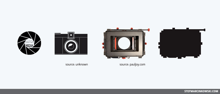
I was concerned that a matte box is too obscure an icon for the average person to decode, and too complex a shape to function as part of a logo. AJ assured me that this logo is targetted towards film industry pros who are familiar with all the tricks of the trade. So I started with the mate box, even though I still had doubts that it could work.
Since I know so little about filmmaking, I did some research and asked a ton of questions to learn some terminology and wrap my head around what this logo needed to communicate. AJ revealed that he had a preference for the courier typeface, he wanted a design that would work just as well in reverse, and there was to be no colour in the logo at all.
Dutch is a film term that refers to using diagonals to compose and frame shots, as in dutch angles. In the Die Hard (1988) DVD commentary track, director John McTiernan speaks at length of his fondness for dutch angles and his use of triangles throughout the film. Amazing stuff. Since dutch angles are the raison d'être for this logo, it was essential that the logo exude triangleness. The suggested angle of 45˚ was far too steep to allow for easy readability, so I went with a more reasonable 15˚ angle for all the skewed logos shown here.
With the foundation solidly-laid, I set out to make squillions of roughs, though most of them aren't shown here. Despite the omissions, this is still a decent overview of my thought process and the logo's evolution.
I started off with the matte box, trying a few things with and without an iris.
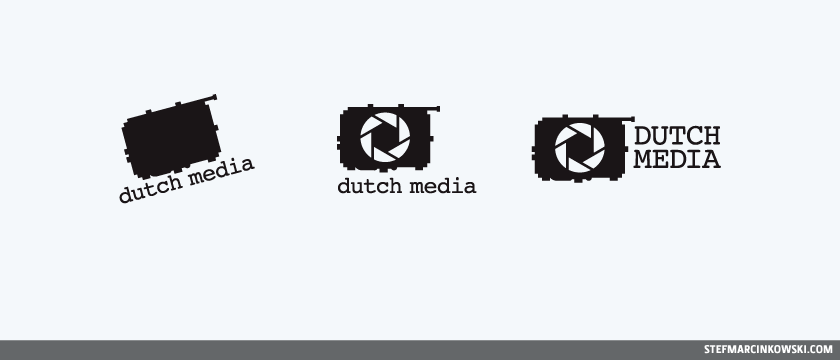
Hmmm, I'm not vibin' on these. C'mon SON!
The matte box itself is a vague and distracting shape, while the iris is the truly sexy part. In fact, the iris is perhaps immediately reminiscent of the Aperture Science logo. Well, maybe I can leverage that.
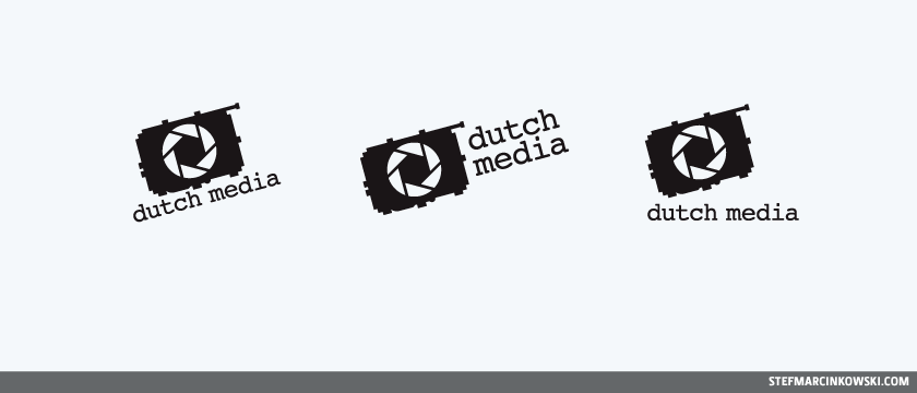
Then again, maybe not.
28 seconds into the design phase, and I was already leaning towards ditching the matte box altogether. But AJ really wanted a matte box, so I tried to simplify it.
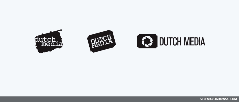
The simplified matte box was looking a bit like a movie ticket stub, which was already veering off-target conceptually, looking more like an 8-bit representation of a box with rounded corners. I was liking the Akzidenz Grotesk type on the logo above on the right. I might come back to this.
However, I wasn't feeling the box idea at all, so I went back to the iris to use on its own. What other iconography is associated with TV and movies that I can tap into?
Filmstrips.
Yes. I drew a vector filmstrip and started playing around.
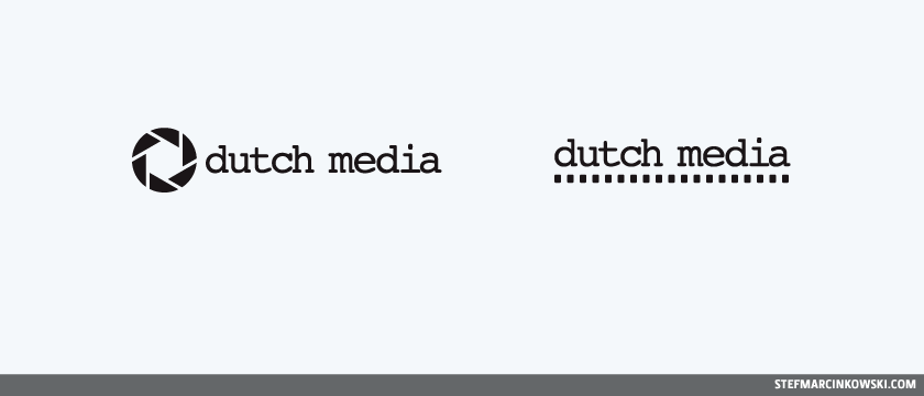
Not bad, but let's take things to the next level. Let's reverse the type out against filmstrip backgrounds.
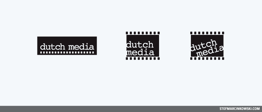
Getting warmer. But the challenge now is: how to sell the idea of dutch angles?
Let's try spinning. That's a good trick.
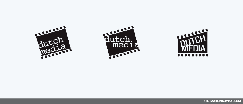
Whoa. That's kinda looking like a clapboard now, too!
And so, just like that, the logo was finalized AND signed-off on its first draft. Check out AJ's sick demo reel and see this sexy logo used at the end.
Enjoy!