"Nice portfolio, but I'm not seeing any vehicle wraps."
This was an actual quote a nameless recruiter said to me this past summer.
At first, this comment made me feel totally innadequate and full of shame, despite my many career successes. But I was determined to not let this get me down. Cuz while I love cars and graphics with equal passion, I just never had any opportunities come up to design a vehicle wrap.
And how do we get opportunities to do things we've never done before?
We MAKE THEM.
Determined to do a wrap, I started by Googling local vehicle wrap shops and I sent out a bunch of cold emails, offering to design a wrap for free, just to get some experience. I got a prompt response from Avi Barak of
Sign Source Solution
in Vaughan, and he agreed to have me come in and meet him and his team. He was actually in need of a full-time, experienced wrap designer who can also do graphic installation, which I clearly wasn't cut out for. But I was confident I could learn anything at wrap warp speed. Afterall, most people are capable of doing some pretty incredible things when our backs are against the wall and we have no choice but to excel and deliver. I was eager to jump at the opportunity to learn and train, so I went home that night and designed a rough concept, based on what I learned earlier that day:
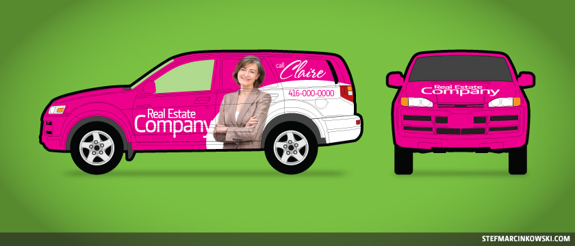
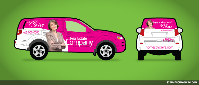
Avi was impressed with my initiative and suggested I come in for a couple days and get a feel for how things work. I gladly accepted. The first couple days, they were starting a full wrap on a Mercedes Sprinter van, and I helped design and lay out the artwork for the hood. In all, I spent a week working from home and in the shop; using their computers and also helping in the back. I asked squillions of questions and I carefully watched every little thing the guys were doing.
That's when I met Ben Bieber of Evil Kitty Graphics , who came in to help get the Sprinter finished on schedule. Ben's done over 200 vehicle and commercial wraps, and he also travels to teach wrap courses. This dude is a rockstar, and he showed me tons of pics of his latest installs; truly fascinating and inspiring work. He took the time to share with me a lot of tips and tricks, he explained media types and he also warned of several common mistakes to watch out for. Thank you so much, Ben!
During this time, a design job had just come in for Marisa Roque , a Real Estate Agent serving the GTA. She has a cute little Smart car, and she wanted to have it wrapped in her Century 21 colours. The creative brief was pretty straightforward: use black and Century 21 gold, and incorporate Marisa's head shot, a URL, a phone number, and add several logos: MLS, Air Miles and Century 21.
I quickly came up with two initial concepts for a full wrap. I wasn't sure who was more important, Century 21 or Marisa herself, so I hedged my bets and came up with one design for each scenario:

For this second design, I created a stacked logo for Marisa's name on the doors.
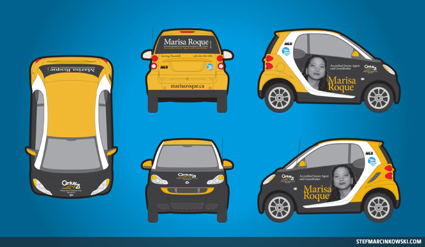
While these two designs were well-received, there was a strict budget for the project. As a solution, a partial wrap proved to be far more economical than a full wrap. To make a partial wrap, a vehicle's body colour becomes a key design element. Graphic elements are printed onto substantially smaller pieces of substrate and run through a "plotter"; a cutter that forms letters and shapes. It's basically a huge decal-maker. The decals are then applied to the vehicle, and as the backer is lifted away, the graphics remain in place. At this time, I learned that Marisa's Smart car was solid black on black, so we used this black canvas to our advantage. Marisa was particularly fond of another partial Smart wrap; a black car wrapped with a silver "C" panel. Moving forward, the revised design began to take shape:
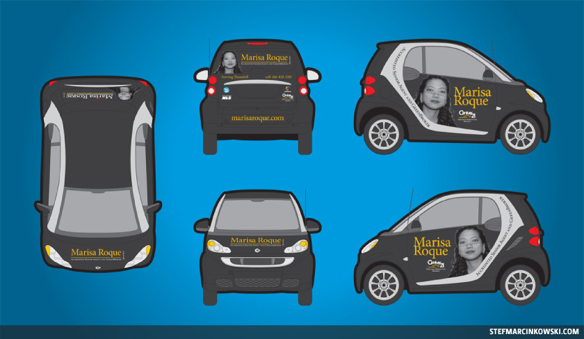
Things were looking better, though a few more refinements were still necessary. Most noticeably, the silver panels were changed to Century 21 gold. Also, "Broker" was added to Marisa's logo, and I was particularly pleased with creating a more consistent brand through use of a single stacked logo on all four sides of the car.
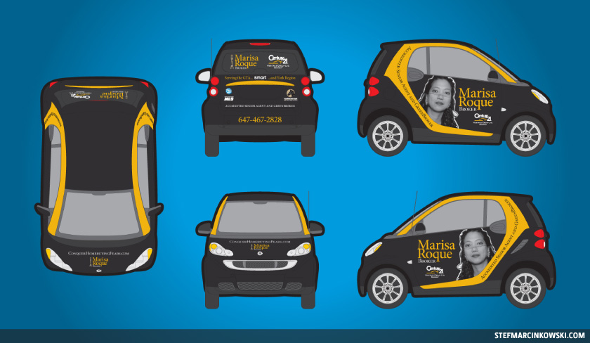
Things were getting very close now. However, there are strict guidelines where a realtor name and company name must be of equal size, so I played with both to strike the right balance. Also, a second URL and another logo were added, the trunk tagline was changed and the URL across the hood was reversed so drivers ahead could read it through their rearview mirrors. Finally, a hires scan of Marisa's 8x10 greyscale photo was made. It was cleaned up, and her jet-black hair was defined by a strong white keyline to give her some punch against the car's black doors.
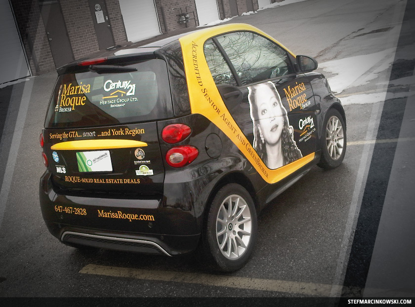
Here's the final, approved artwork:
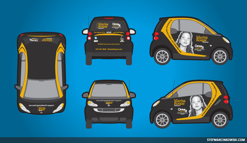
Once Marisa's car was washed and delivered to the shop, we took final measurements and made a thorough inspection of all of the car's fine details. We noticed that the doors have a very thin, deep channel down their lengths, and getting the small letters to fit into it, look nice and be readable at an angle, and at a distance, was a very big concern. At the last minute, we tweaked the door elements slightly to avoid running through this channel.
And there you go. Just like magic!
This was a fantastic project to work on, and my only regret is that I didn't get the opportunity to help with the installation of the graphics. That would've been awesome.
Big thank yous all around to Avi, Alberto, Diego, Ben and Marisa for such a fun and valuable experience that could open up many more opportunities in the future.
Now, this wrap came along just as I was gearing up for a contest offering a free vehicle wrap design to the first taker. I will happily honour this contest and design a free wrap to the first company to respond, so email me today! ( stef at stefmarcinkowski dot com ).
And the next time someone chooses to focus on what you haven't done, remember that you have the power to focus on moving forward. Take charge, and you'll be surprised at your resourcefulness and the connections you'll make along the way. So get out there, and make some opportunities!
Enjoy!
