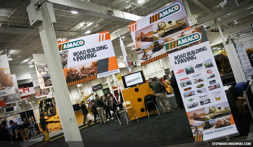
One of my newer clients, Amaco Construction Equipment Inc., recently exhibited at the National Heavy Equipment Show, April 18 and 19, 2013, at The International Centre in Mississauga. I was offered a show pass to come check out the booth graphics I designed, take a few pics and explore the show floor.
It was a really interesting show, the first of its kind I’d ever attended, and it was far more intimidating than any Canadian International Auto Show ever was. I expected these huge, ginormous, 2-storey machines and rock crushers to suddenly transform into giant robots and start wrecking the place. There were lots of things to see and do, and the “Backhoe Rodeo” looked pretty fun: backhoe operators compete against one another by scooping little soccer balls off highway cones and dropping them into a nearby bin.
Wandering through the show aisles, I discovered and talked with many fine people, including:
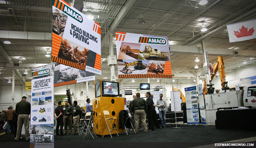
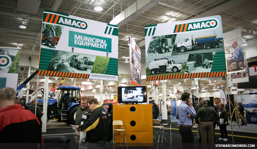
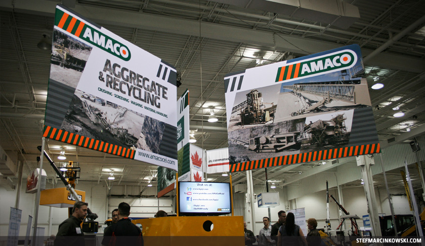
Now, amidst all this fun and adventure, I eventually did make my way to the Amaco booth. Amaco Construction Equipment Inc. is a heavy equipment distributor based in Mississauga, who focuses on servicing three main divisions: Road Building & Paving, Municipal Equipment and Aggregate & Recycling.
The Amaco booth graphics I designed comprises of six 10’ wide displays, mounted to metal poles 10’ in the air and arranged back-to-back in a triangular formation. The displays were complimented by three 33” wide by 86” high banners that I also designed. All of the artwork was printed onto fabric by McRae Imaging, who then sewed the displays together and wrapped them over a metal framework.
Here are a few pics of the Amaco booth from the 2013 National Heavy Equipment Show:
I don’t often document my creative process for client work, but I did for this project, and I’m sure glad I did, cuz it’s a great story. Here’s how this trade show booth all came together.
I met with Amaco for the first time on December 20, 2012, just days before the Xmas holidays. After a nice cup of coffee (or three), Jamie and Cameron presented aerial and front-on technical drawings of how the booth space was planned to look. We discussed the overall concept, brainstormed some general Art Direction and explored potential graphic ideas. Digital images for tons of equipment and vehicles were supplied, as well as a vector Amaco logo, and I asked for as many different print materials as they had on hand for my research.
When meeting with clients, particularly new ones, I tend to ask millions of questions, take lots of notes, do my best to pay attention to every little detail and make sure I understand everything, cuz nobody likes nasty last-minute surprises. It’s always best practice to gather as much information as possible, and there were quite a few interesting and important puzzle pieces that needed consideration before I began. Amaco needed:
While all this information might seem a bit daunting to some, these were fairly straightforward and important considerations. They helped direct, focus and streamline the entire design process from start to finish.
But I knew time was short; Amaco was planning well ahead for April’s Heavy Equipment Show, yet they were also hoping to exhibit at a smaller show in early January. I wanted Amaco to be ready for BOTH shows, so I created a rough calendar workback schedule to ensure final, printed artwork would be ready in time:
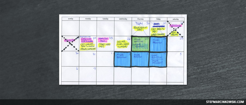
I’m so glad I made this calendar, because it revealed that I needed to create initial proofs that same day in order to hit the final deadline. More on this later.
So, after our meeting, I got home, reshuffled my work schedule and entire life, and got started with several hours of hardcore research. I analyzed:
I found that Amaco’s branding was quite simple, but not always consistent. It tended to use lots of white, though it occasionally used a bold green and orange strobe stripe that played off the Amaco logo. I really liked the stripe and started with this.
I began sketching rough concepts well into the wee hours of the night. Below, the image on the left is the original aerial drawing of the booth layout. The other two images are just a few of the many sketches I made:
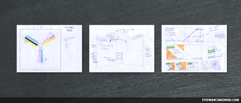
I really loved the diagonals in Amaco’s logo, so I kept pushing the design in this direction.
Here are some rough notes, ideas and concepts:
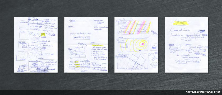
After I’d amassed squillions of sketches, I took the best ideas to the computer and started playing around in Adobe Illustrator CS5. As part of creating a modular design, I set up coloured placeholders where visual elements would be placed later on:
I quickly realized that for each 20’ display, rather than design two separate 10’ displays and mash them together, it would be far smarter to design a single 20’ display and split it down the middle. Eventually, I came up with this rough, semi-final layout:
With a solid infrastructure now in place, I continued to tweak the layout while dropping in images. This concept was approved pretty much right away with only minor changes, and a fair bit of photo swapping.
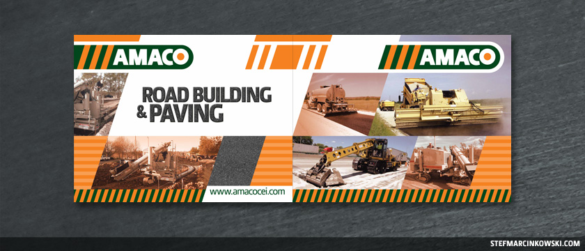
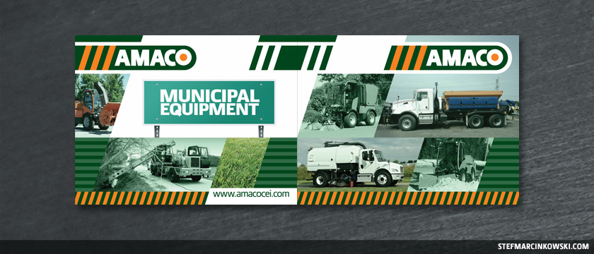
To leverage Amaco’s corporate colours, I branded each division as follows:
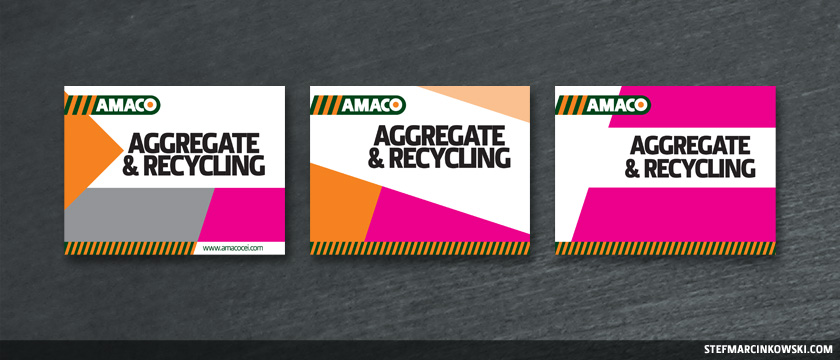
Here’s the semi-final, 20’ Aggregate layout:
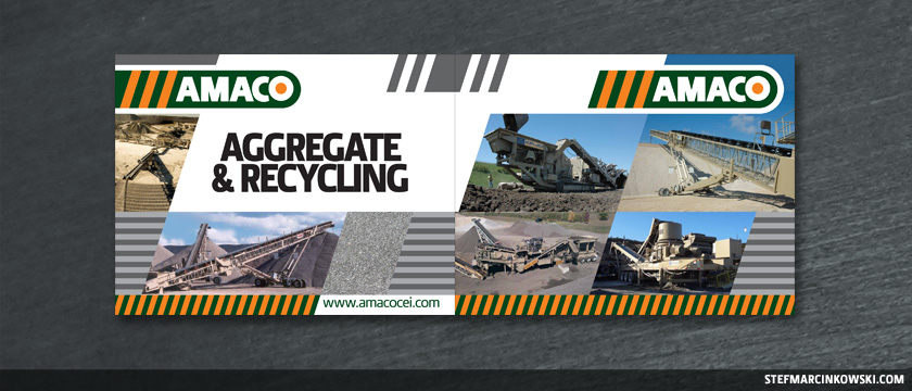
For a touch of visual interest, I added texture swatches to each division: asphalt, grass or rock.
During the design process, many of the equipment photos were too colourful and bright, en masse, to create a cohesive brand vision. So, I used selective colour gels and image desaturation to help tie each division’s visuals together.
“This is all wonderful,” you’re probably saying, “but what happened with that calendar workback schedule?”.
Well, I’m glad you asked.
I presented initial proofs on Dec. 21st and had an out-of-town wedding on Dec. 22nd that I had to work around. I came back on the 23rd and continued to work straight through Xmas, staying in touch with the Amaco team all the while for review and approvals.
Lo res artwork was approved and signed-off on Dec. 25th, leaving less than 48 hours to produce the final, hi res art. I cancelled out on some holiday visiting time to stay home and crank out the finals.
In creating the hi res art, tons of Photoshop work was needed to clean up and resample the images, remove logos, and in many cases, expand the image canvas and build out backgrounds to properly fill out the angled picture frames.
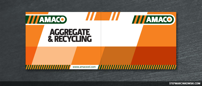
The final art was created in Illustrator CS5 with Photoshop CS5 backgrounds dropped in on a separate layer. The completed job was easily several GB; far too much for quick FTP upload, so I delivered final artwork to McRae in person on December 27th, giving them five days turnaround time for printing and finishing.
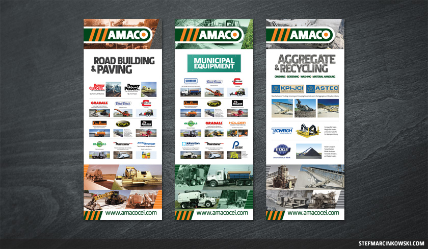
Here is the final artwork for Road Building & Paving:
Municipal Equipment:
Aggregate & Recycling:
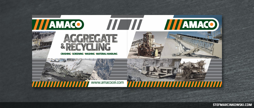
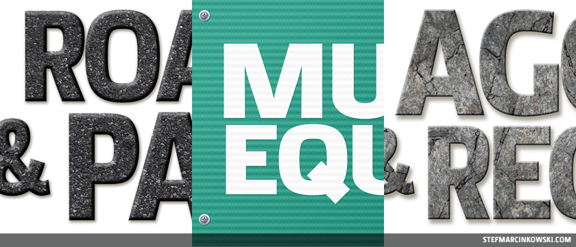
To give each division’s header type a nice, realistic treatment, fresh asphalt was laid down on the Road Building heading; A municipal-type sign was created for, you guessed it, the Municipal heading; and crushed rock was used for the Aggregate heading.
Here are some closeups of the header type:
Not bad. Not bad at all.
Alrighty then, this wraps up the 10’ displays. In addition, I created three vertical banners, using the same creative. Heavy Photoshop work was again needed to expand the canvas of most of the images. And as with the displays, I created a modular layout that accommodated for a varying number of vendors. And despite the quest for vector or hi res vendor logos, I went over and above the call of duty by rebuilding and redrawing the really bad ones at the last minute.
Here are the final banners:
So then, the National Heavy Equipment Show was a mega success for Amaco, and their booth received many compliments, including, “Wow, we didn’t even know you guys did X, Y or Z”. Awesome. Communicating clearly and delivering strong messaging is what good design is all about.
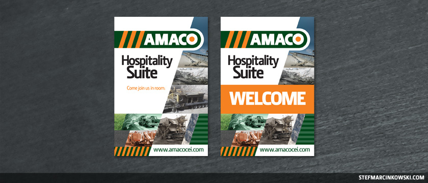
Lastly, I did a smaller job for Amaco a few months back; two 24” x 36” wayfinding posters that were mounted to Sintra and equipped with easelbacks.
Below, the poster on the left was for location inside a venue’s entrance; the other was for use just outside the meeting room. I chose dry erase lamination to allow for convenient room numbering and indefinite reuse. Behold:
I’m looking forward to seeing what the future holds for Amaco, I love working with these guys, and I’ll always be ready at a moment’s notice to bring continued value to their ongoing success.
Enjoy!
LOGOS, BROCHURES, BUSINESS CARDS, POSTERS, POSTCARDS, DIRECT MAIL, REPORTS, CATALOGUES, BINDERS, BOOK COVERS, POCKET FOLDERS, ADVERTISING AND MARKETING PIECES, STATIONERY, LETTERHEAD, ENVELOPES, NEWSPAPERS, MAGAZINES, BANNERS, TRADE SHOW DISPLAYS, PACKAGING, P.O.P. DISPLAYS, SHELF TALKERS, WHITE PAPERS, TRADITIONAL AND DIGITAL ILLUSTRATION, iOS GAME ART, VEHICLE WRAPS, WEDDING INVITES, CDs, DVDS, DIGITAL MENUBOARDS, INTERACTIVE PDFs, CHARTS, GRAPHS, WORD AND POWERPOINT TEMPLATES / PRESENTATIONS, PHOTOGRAPHY, PHOTO RETOUCHING / MANIPULATION, COMICS, WEBSITES, WORDPRESS, E-COMMERCE, AND MORE, MORE, MORE.