
McRae Imaging is the undisputed world-leader in digital imaging and fabric printing, starting out in downtown Toronto many years ago as a humble photography studio/film developing house. Back in the mid-90s, they saw their industry shifting, so they positioned themselves as one of Canada’s earliest adopters of large format printing. They haven’t looked back since.
I joined McRae in 1999 as a fresh graphic design grad, mainly for preflight and preparing client art for output. As McRae readied itself to take on more creative work, pure design would become a much bigger part of what I would achieve.
Jumping ahead a bit, McRae was selected to design trade show graphics for the North American Merchants Association. NAMA’s theme was “The History of Vending Machines”, where they envisioned a series of pieces to represent distinct eras. This was my biggest-ever McRae project; it was my big chance to prove myself.
I read, searched and researched for ideas to capture the cultural zeitgeist of each decade. My initial concepts were ambitious, and were surprisingly approved with very few changes.
Here are the five banners:

NAMA also wanted life-size, floor-standing cutouts to accompany the banners. Since there was no budget to purchase images, I started with clipart from a 250,000-image collection I had, and I modified the images to work with the banners. Check out five-foot-ten NOT me rockin' out:
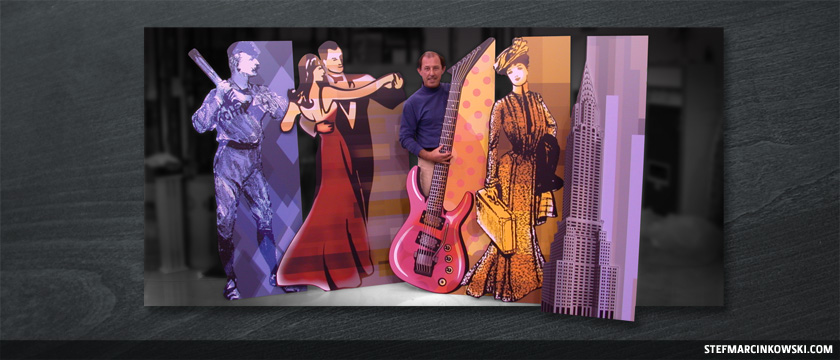
The NAMA booth graphics were an instant hit. Holy crap! They won a Best-in-Show award, and my ego swelled up like a balloon. I became an overnight Diva, but that’s another story, for another time.
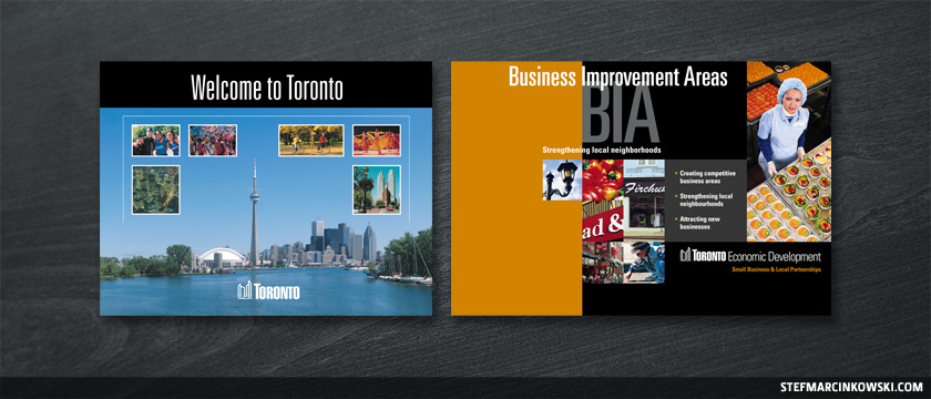
No actually, I lied. Let’s get into this right now. The reason I became a Diva was because I’d already designed another award-winning booth display the year previous. It was for the City of Toronto/Canada Blooms, and I somehow believed I was the most awesome designer in the world. Sadly, I never kept a copy of that eye-searing, neon green and orange art. Lucky you.
And speaking of Toronto, here are a couple other City of Toronto trade show booths I designed:
During my nearly four years at McRae, I cranked out a lot of trade show booths. Now, to help convey a proper sense of scale, check out five-foot-ten me standing next to this CTDG display:
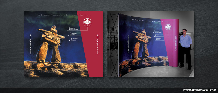
TRIVIA TIME: The Inukshuk photo was originally a daytime shot. I created the night sky, complete with a simulated Aurora Borealis effect made from blurred vector art.
My biggest-ever display was a 20-foot unit for Genpharm, which comprised of two 10-foot units placed end-to-end. Genpharm supplied us with six beautiful Canadian landscape panoramas that I wasn’t sure how to incorporate at first. After some serious brainstorming, I came up with the simple concept of an unraveling DNA strand:

So, yes, lots of big stuff, but I also did tons of smaller stuff as well.
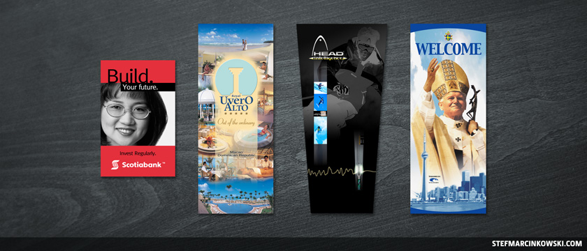
Here are samples of smaller, one-off pieces I designed, such as table-tops (Scotiabank), roll-it-up floor banners (Uvero Alto), and custom banners (Head). Perhaps my most prolific piece ever was a banner I did for World Youth Day 2002, which appeared on the front page of the Globe and Mail and briefly on CNN:
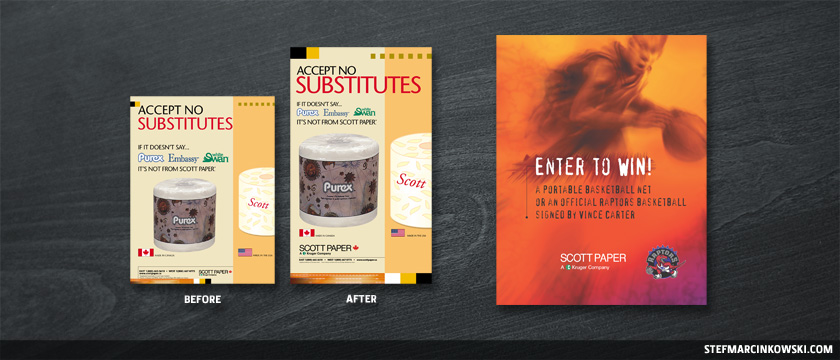
Production was still a big part of my every day job, and often, sizes and aspect ratios of client-supplied art needed to be corrected. It was of great value for me to fix things than to risk missing critical deadlines.
Here is a typical example of a “before and after” resizing and aspect ratio change for Scott Paper. I designed many other Scott pieces, including this Toronto Raptors poster:
The poster was a pretty fun example of carte blanche design, and in fact, I’d go so far as to say about 80% of the pure design I did was carte blanche. Everything I’ve shown so far was carte blanche. The early 2000s truly were the “Wild West” days of graphic design. Back then, it seemed few people knew or cared much about branding, corporate communications or graphic standards, ha ha. Clients loved this carte blanche stuff, and I was happy to oblige.
And talk about carte blanche supreme: McRae gave me my first-ever food-related branding and design project. This was for a new product called Imperial Chai, created especially for Rabba’s Fine Foods:
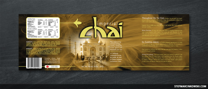
I designed everything from the logo and can labels to shipping stickers, dispensing machine backlites, posters and even floor clings. This stuff tasted great, and I got inspired by and addicted to it. Drinking Imperial Chai was like drinking warm honey with the slightest hint of even more honey.
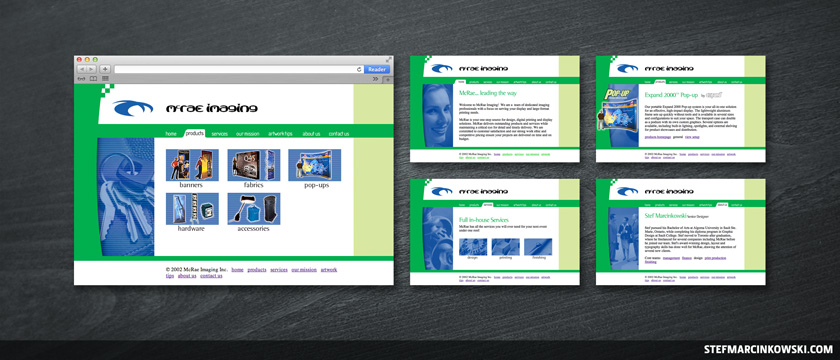
By now, McRae was in hardcore growth mode, so it was finally time to develop an identity of its own. Inspired by soaring eagles and sharp talons, I started by designing a logo and wordmark font while commuting home in the back of a bus:
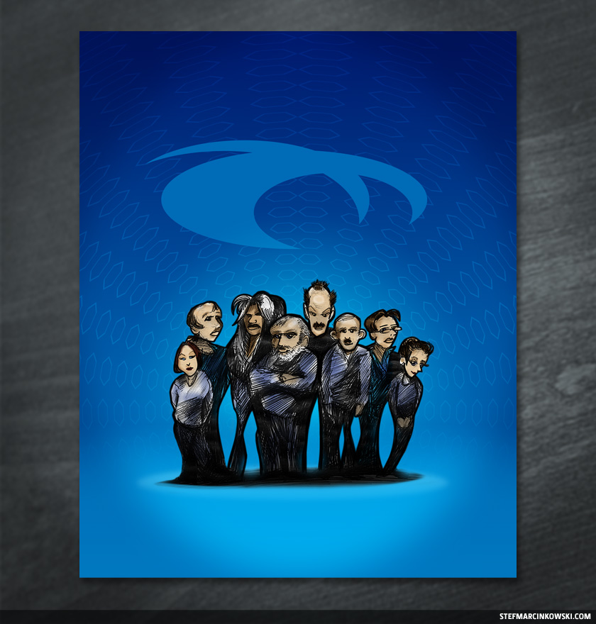
I then turned my attention to coming up with a visual language by starting on a brochure-type piece. The McRae team were my friends and my family, and I wanted to incorporate some of the company’s personality into the piece. I drew rough caricatures of the team and put us into this first-draft layout:
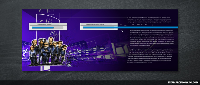
One of the most important design philosophies McRae ever taught me was that good design is not about pretty pictures; it’s about clear communication. This creative was not communicating. It was too dark, it lacked charm and it was missing something I couldn’t quite put my finger on at the time.
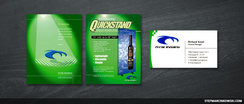
Since McRae’s business was primarily showcasing their client’s brands, I instead came up with the idea of using a spotlight as a metaphor. Vibrant greens played off the logo’s blue much better, and we finally had the start of something that could go somewhere. I designed flyers, brochures and business cards, all using similar creative:
I also made a company website in Netscape Composer, cuz that’s all I knew at the time, ha ha. Don’t laugh.
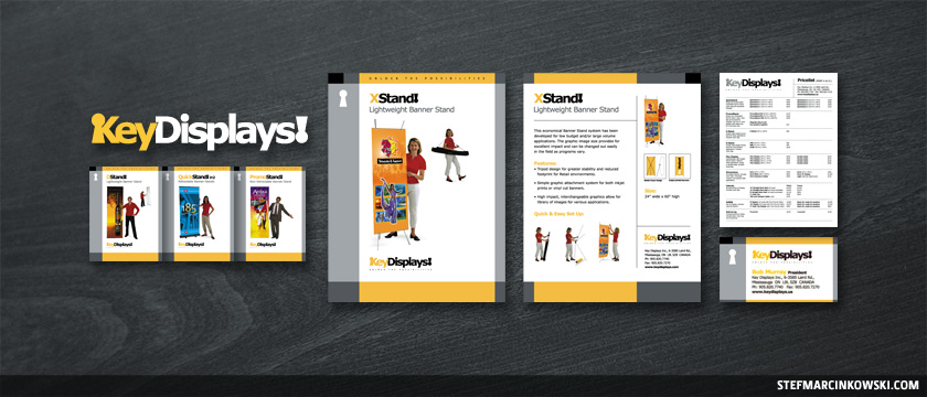
My bromance with branding continued, as McRae formed a new company, Key Displays. The art direction was incredibly simple: capture the elegance and shimmering silvers of the Mercedes Benz website, and juice it up with a splash of colour.
I started by designing the logo while driving home (no more busses for me). I got inspired behind the wheel and had to stop at a coffee shop. I whipped out the laptop and banged out a solid concept in about an hour. A warm, gold hue seemed to be the perfect accent colour.
Here is some of the final creative, which included 8.5 x 11 double-sided sell sheets, a fax price list and business cards:
So, branding is awesome. And by this time, McRae was already heavy into fabric printing, which had opened up limitless possibilities for increased design flexibility, improved durability and decreased production time.
And before I left McRae in 2003, they already brought on a few more graphic designers. I taught them all I knew about best practices and how to best manage their time and workflow. It was finally time for me to move on.
Fast forward to late 2012, when I finally got back in touch with the McRae family after nearly a decade. I stopped by for a long-overdue visit to see their newly expanded Mississauga facilities, and I presented them with a framed redux of the now classic group shot I drew 10 years earlier.
I will always treasure my time with McRae. Working with them taught me so many great design, and life, lessons.
Enjoy!