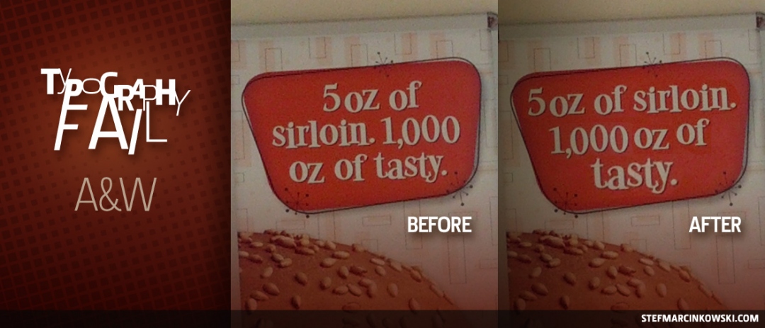
Your passion for design and typography spills over into every facet of your life, and those closest to you take notice and are forever changed. You know you're fully hardcore when friends and family start sending you random pics of crappy design and type they find in public.
So then, someone I know (who isn't you), was slammin' back a few burgers at an A&W joint and felt compelled to send me a photo of this sad poster. Awesome.
While I'm a little crestfallen I didn't get the chance to wolf down 6 cheeseburgers, I am happy to see this poster has a few line break issues that add up to one awkward headline.
Think of line breaks as periods. When the human eye reads a line of type, it takes just a few nanoseconds to start reading the next line. During those key nanoseconds, our brains insert a pseudo-period between each line of type. Even though we know there's no punctuation, our brain puts it in there anyway. Behold:
5 oz of.
sirloin. 1,000.
oz of tasty.
Doesn't sound very appetizing, does it? It also doesn't make much sense.
This "pseudo-period" phenomenon is pretty striking when reading short bursts of text, and yet, for some reason, it's nowhere near as noticeable when reading body copy. We do a pretty good job of parsing body copy, but it's much diferent when we read headlines and subheads. To combat this phenomenon, whenever possible, insert line breaks that make logical sense and produce a more conversational tone. Behold:
5 oz of sirloin.
1000 oz of.
tasty.
While it would be ideal to fit "tasty" up onto the previous line, spacing simply won't allow it. So the next best option is to put "tasty" on its own line, leaving the reader with a succulent, juicy impression of this 5 oz burger.
But wait, there's more! The original poster's awkward line breaks have caused another, more serious typographical faux pas: breaking numbers and units of measure.
It's best practice to always keep numbers and their units of measure together on the same line. Things such as 280 km/h, 280 mg, 280 ˚C, etc., should never be broken because they're more difficult to read and process. Line breaks can get even more tricky when dealing with french type, such as with numbers. There is no comma between the hundreds and thousands like there is in english, as in 2 800 (french) vs 2,800 (english). So how can we keep the "2" and "800" together? And how can we prevent the "1,000 oz" from breaking?
The solution is simple. With your type tool active, select the space between "1,000" and "oz", and insert a nonbreaking space. In InDesign CS5 on the Mac, go to Type > Insert White Space > Nonbreaking Space, or simultaneously press command-option-X on your keyboard. Quark and other page layout programs will have similar capabilities.
When working with type, it's also a great idea to show hidden characters. In InDesign CS5 on the Mac, go to Type > Show Hidden Characters, or simultaneously press command-option-I. You'll see symbols representing lots of invisible characters, such as hard and soft returns, spaces, nonbreaking spaces, and more.
Finally, a nice side effect to these line break improvements is the improved fit between the type and the orange box; it just looks better. And as a subtle little bonus, I slightly increased the size of the "tasty" just a wee bit. So whenever you're laying out type, particularly headlines and subheads, always read them aloud to hear how they sound, and always remember to
use line breaks
to your advantage.
Enjoy!
